

Sunday, February 27, 2011
ECU Combines State Outline with Logo Imagery
Following up on my immediately previous posting about UNC-Chapel Hill's state outline at the Dean Smith Center (below), East Carolina University (which is in North Carolina) has found a unique way to incorporate the same shape, but suffuse it with imagery of the school's Pirate logo. Via a cool website called Arena Fanatic, which reviews the experience of attending games at various sports venues around the nation and is worth checking out, we have the following look at ECU's center-court logo, which I've zoomed-in on...


Sunday, February 20, 2011
North Carolina Comes Full Circle
This may seem like a relatively small change, but I think it makes a big difference visually. In Chapel Hill, the University of North Carolina's Dean Smith Center (or "Dean Dome") has consistently featured a filled-in light-blue outline of the state and the school's NC-overlay logo. Prior to the current season, the NC was surrounded by a traditional center-court jump-ball circle, also filled in with light-blue (top of following display). This season, however, the NC falls directly on the shape of the state, without the larger light-blue center-circle (bottom of display).

I like the old (top) design as it makes the NC look more, pardon the pun, "centered." (The top image comes from this YouTube video, whereas the bottom one is from the ESPN3.com archived video of this year's Wake Forest-UNC men's game.)
UPDATE: The fully filled-in, light-blue jump-ball circle is back for the 2011-12 season.

I like the old (top) design as it makes the NC look more, pardon the pun, "centered." (The top image comes from this YouTube video, whereas the bottom one is from the ESPN3.com archived video of this year's Wake Forest-UNC men's game.)
UPDATE: The fully filled-in, light-blue jump-ball circle is back for the 2011-12 season.
Friday, February 18, 2011
If You Like Fire-Breathing Dragons...
...then the courts at Drexel University (Philadelphia) and the University of Alabama Birmingham are for you. Drexel's teams are actually called the Dragons...

...whereas UAB's teams are known as the Blazers, but feature the mascot "Blaze the Dragon."

These screen captures were made from the following YouTube videos: Drexel, UAB.

...whereas UAB's teams are known as the Blazers, but feature the mascot "Blaze the Dragon."

These screen captures were made from the following YouTube videos: Drexel, UAB.
Saturday, February 12, 2011
Why Must Schools Make Their Abbreviation Letters So HUGE?
I've made several postings over the years about the outsized logos many schools have displayed on their center-court areas. Lately, I've noticed a couple of floors whose center-court decorations consist only of the school's abbreviation letters.
Having grown up a UCLA fan and seen those letters presented in a small and compact arrangement, I am frankly amazed at how gigantic Loyola Marymount University (LMU) and Auburn University (AU) have made their respective center-court abbreviations.
As shown first below, even with only three letters, the LMU design nearly stretches from the three-point arc on one side of the court to that on the other. (I made a screen capture from the official LMU athletic website of video highlights from the men's game against San Francisco.)

Meanwhile, at the new Auburn Arena, the AU overlay takes up quite a large proportion of the area between the two three-point arcs (photo from here).

Maybe it's just me, but I find such large letter logos distracting and jarring to my sense of proportion. In addition to the aforementioned UCLA court at Pauley Pavilion, I think Texas Christian University (TCU) has good sizing for its abbreviation at Daniel Meyer Coliseum.
Having grown up a UCLA fan and seen those letters presented in a small and compact arrangement, I am frankly amazed at how gigantic Loyola Marymount University (LMU) and Auburn University (AU) have made their respective center-court abbreviations.
As shown first below, even with only three letters, the LMU design nearly stretches from the three-point arc on one side of the court to that on the other. (I made a screen capture from the official LMU athletic website of video highlights from the men's game against San Francisco.)

Meanwhile, at the new Auburn Arena, the AU overlay takes up quite a large proportion of the area between the two three-point arcs (photo from here).

Maybe it's just me, but I find such large letter logos distracting and jarring to my sense of proportion. In addition to the aforementioned UCLA court at Pauley Pavilion, I think Texas Christian University (TCU) has good sizing for its abbreviation at Daniel Meyer Coliseum.
Saturday, January 22, 2011
Demise of the Cartoonish Logo on Hoop Courts?
ESPN.com columnist Jim Caple had a piece the other day about how, in baseball, teams have been moving away from "playful cartoon" logos toward "more corporate" alternatives. I haven't done an extensive study of whether the same trend has overtaken NBA and college basketball courts. Yet, one example immediately came to my mind of where playfulness has given way to professionalization: The University of Minnesota's Williams Arena. Whereas center-court used to feature Goldy Gopher dribbling a basketball, it now features a large "M" in the university's official style.


Wednesday, January 12, 2011
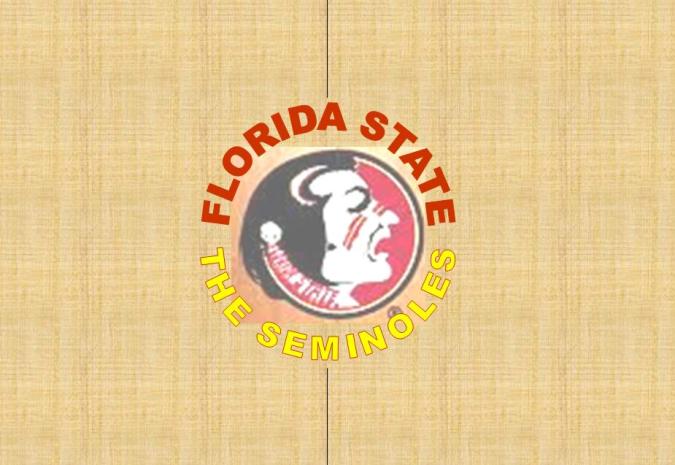
A Little Floor to Enhance the Logo (Florida St.)
Until recent years, it seems, teams' center-court logos were roughly the size of the jump-ball circle (here's one example). To my eyes, that scheme worked well, allowing the logo to enhance the overall look of the court, without overwhelming it. The trend, however, has been toward bigger and bigger logos, as documented in previous postings on this blog (here, here, here, and here).
Tonight, as I watched ESPN's broadcast of Florida State's upset win over defending NCAA champion Duke, I saw yet another example of the outsized emblem, on the Seminoles' court. As shown in the before-and-after photos below, the circular Seminole logo has grown in size (top photo) compared to past years' version, at the expense of the "FLORIDA STATE" and "SEMINOLES" lettering.

(The FSU-Duke screen capture is from ESPN3.com's archived broadcast of tonight's game, whereas the older FSU-Jacksonville footage is something I found on YouTube.)
Not that anyone at Florida State has asked me, but I would suggest something along the lines of the following mock-up I created (with the circular Seminole logo just a little bit bigger than the jump-ball circle).

Tonight, as I watched ESPN's broadcast of Florida State's upset win over defending NCAA champion Duke, I saw yet another example of the outsized emblem, on the Seminoles' court. As shown in the before-and-after photos below, the circular Seminole logo has grown in size (top photo) compared to past years' version, at the expense of the "FLORIDA STATE" and "SEMINOLES" lettering.

(The FSU-Duke screen capture is from ESPN3.com's archived broadcast of tonight's game, whereas the older FSU-Jacksonville footage is something I found on YouTube.)
Not that anyone at Florida State has asked me, but I would suggest something along the lines of the following mock-up I created (with the circular Seminole logo just a little bit bigger than the jump-ball circle).
Sunday, December 19, 2010
Texas Showcase (in Dallas)
Yesterday, the American Airlines Center in Dallas hosted a men's college doubleheader, known as The Showcase, pitting Arkansas against Texas A&M, and Gonzaga against Baylor. People in few, if any, states like to display their spirit and symbolism more than Texans, as illustrated on the court below (screenshots from ESPN3.com's video archive).

In keeping with the design of the Texas flag, the left half of the court (from the television perspective) had its entire out-of-bounds area and sides of the key (the area denoting the difference between college and pro keys) in blue. On the right side of the court, these features were split between white and red.

In keeping with the design of the Texas flag, the left half of the court (from the television perspective) had its entire out-of-bounds area and sides of the key (the area denoting the difference between college and pro keys) in blue. On the right side of the court, these features were split between white and red.
Subscribe to:
Posts (Atom)


