
Thursday, December 22, 2011
NBA Court Changes 2011-12
According to Uni Watch (via Matt Rachmiel), "the Blazers, Pistons, Raptors, Rockets, Thunder and Wizards have made adjustments to their court designs." If you go to Uni Watch's NBA preview and scroll way down, you'll see a link to view these new courts. Most of the changes seem modest in scope, except for those of the Wizards, who changed their logo and team colors to match more closely with the red, white, and blue scheme of the late 1970s Washington Bullets.
Friday, December 9, 2011
Butler Did It! (Expand Its Center-Court Logo)
Frequent contributor Matt Rachmiel informed me that Butler University has added the school name under its traditional Bulldog center-court logo at Hinkle Fieldhouse in Indianapolis. In the past, only the logo was present. Below is a screen capture of ESPN.com's online highlights of Wednesday night's Butler game, hosting Xavier.

I suppose it's just the font, but looking at the word BUTLER on the court almost makes me seasick!

I suppose it's just the font, but looking at the word BUTLER on the court almost makes me seasick!
Sunday, December 4, 2011
U Can't Miss Miami's Giant Center-Court U
Following up on my previous posting about Nebraska's huge "N" at center-court, I see now that the University of Miami has a giant "U" gracing the center of its court. The following screen capture is from the ESPN3.com archive of tonight's Memphis at Miami contest.

When will it end?

When will it end?
Thursday, December 1, 2011
Nebraska the Latest to Go Huge at Center Court
As has been abundantly documented on this site, more and more schools have been going to huge center-court logos in recent years (for example, here, here, here, and here). Last night's Wake Forest at Nebraska game in the Big Ten-ACC Challenge displayed the Cornhuskers' contribution to this trend (screen capture below from this video).

This video from last year confirms that the "N" used to be much smaller. Also, there was not the solid white area in the interior of the letter.

This video from last year confirms that the "N" used to be much smaller. Also, there was not the solid white area in the interior of the letter.
Monday, November 21, 2011
Charleston, WV Celebrates Coal
Via Matt Rachmiel and Uni Watch, the Charleston (West Virginia) Civic Center will feature a new court design when it hosts a West Virginia University game Tuesday. (WVU plays most of its home games on campus in Morgantown.) As can be seen in the linked article, the center-court logo combines three different themes: the state outline, a (very rough) orange basketball, and the sponsorship from an organization known as the Friends of Coal. After clicking on the link, you can click on the photo to enlarge it.
Monday, November 14, 2011
UCLA's Temporary L.A. Sports Arena Home
As many readers are undoubtedly aware, the UCLA men's team cannot use Pauley Pavilion this year, as the Bruins' home is undergoing major renovations. UCLA therefore is playing most of its home games this season across town in the L.A. Sports Arena, which is next door to the campus of the Bruins' archrival, USC. The Sports Arena, in fact, was the home of 'SC basketball for many years, until the Trojans moved into the on-campus Galen Center.
The first photo below is from UCLA's opening game the other night, in which the Bruins lost at the Sports Arena to Loyola Marymount. The center logo is very similar to the Pauley floor (second photo); the only difference appears to be the small interior circle, which is yellow at the Sports Arena and wood-colored at Pauley.

The first photo below is from UCLA's opening game the other night, in which the Bruins lost at the Sports Arena to Loyola Marymount. The center logo is very similar to the Pauley floor (second photo); the only difference appears to be the small interior circle, which is yellow at the Sports Arena and wood-colored at Pauley.

The big difference is in the keys, yellow at the Sports Arena and blue at Pauley. As this ESPN.com article explains, "The court was borrowed from the WNBA's Los Angeles Sparks." (The Sparks play at the Staples Center and previously played at the Forum.)
The top photo is a screen capture from this YouTube video, whereas the bottom one is from this video.
Wednesday, November 9, 2011
Uni Watch's College Design Overview
Via Matt Rachmiel, Uni Watch blogger Paul Lukas has posted his annual college basketball preview. The preview focuses, of course, on changes to teams' uniforms. However, there's a brief section at the bottom of the write-up that summarizes new court designs. As Matt says, most of the new court designs listed by Lukas have already been discussed right here at this site, but not all of them.
As some of you may recall, back in August Northwestern put some possible court designs out for a fan vote. By following the links in Lukas's article, you can see which one Northwestern selected!
As some of you may recall, back in August Northwestern put some possible court designs out for a fan vote. By following the links in Lukas's article, you can see which one Northwestern selected!
Tuesday, October 18, 2011
NC State, Evansville, and Kansas State
Matt Rachmiel, my indefatigable informant on new court designs, has brought two new ones to my attention (the first two listed below), plus I discovered one on my own.
One is for the North Carolina State men at the RBC Center. The primary, if not the only, change from the old court appears to be that the areas between the three-point arc and the keys will now have a darker shade of shellac, to set them apart from the other parts of the court.
Second (via Uni Watch, as well as Matt) is the court at Evansville's new arena. The main change from the old court appears to be the removal of the solid orange color from the semi-circles above the free-throw lines. The photo from Uni Watch is from a non-optimal angle, but the Purple Aces' new court seems to look a lot like Kansas State's old one, which is discussed next...
The court change that I discovered is, indeed, Kansas State's. Compared to the old one, the new one:
- removes the "KANSAS STATE" wordmark from midcourt,
- shrinks the stylized Wildcat logo at midcourt (yes!),
- applies dark shellac to the three-point areas,
- colors in the out-of-bounds area in purple, and
- makes "K-STATE" the main wordmark for out of bounds (under each basket and above the center-court area, with "BRAMLAGE COLISEUM" shown in the out-of-bounds area below center-court).
Friday, September 30, 2011
New Illinois Court
With college basketball practice getting started in a couple of weeks, reports of new court designs are trickling out. Once again via Matt Rachmiel, we learn that the University of Illinois will feature a new look in Assembly Hall. The state outline around the big "I" is so subtle, it's visible only in close-up shots.
Monday, September 26, 2011
New Mississippi Court
Via Matt Rachmiel and Uni Watch, the University of Mississippi (Ole Miss) will have a new court this coming season (top). The old design is shown below the new one.


Wednesday, September 14, 2011
Cal State Bakersfield's Blue Court
Cal State Bakersfield has unveiled a nearly all-blue court for this coming season (via Chris Level). Notice also the California state shape at midcourt in a somewhat lighter shade of blue than the main court, behind the yellow Roadrunner logo.
Call me "old school," but I hope this doesn't become a trend. As I blogged about in the entry immediately below, Northwestern may be considering an all-purple-and-white court. Don't do it! Wood looks good. That's why people have hardwood floors, wood ceiling beams, wood dining-room tables and other furniture, etc., in their homes.
Knock on wood, so that schools don't completely cover the wood on their basketball floors.
UPDATE: Reader Tim Kearney has also (independently) e-mailed me a link to photos of the Bakersfield blue court from the school's athletic website.
Saturday, August 20, 2011
Northwestern Seeks New Court Design
Via Uni Watch, Northwestern University has a page up on Facebook, where it is seeking feedback on four potential new designs for the basketball court at Welsh-Ryan Arena. I think No. 4 would have some potential if the three-point area were more of a gray shade, rather than white. Here's what the current floor looks like.
Sunday, August 7, 2011
Bowling Green State (Ohio) to Open New Arena
I recently visited Bowling Green State University in Ohio and saw that the school has a new basketball arena, known as the Stroh Center, set to go into use. Pictures I took of the BGSU campus, including exterior shots of the Stroh Center, are available here. I did a little research on the school's athletics website and learned that the Falcons will have a new court design for basketball in the new building.
Whereas the old court had an orange out-of-bounds area and open keys, the new one will have a brown surrounding area with solid-orange keys.
Whereas the old court had an orange out-of-bounds area and open keys, the new one will have a brown surrounding area with solid-orange keys.
Monday, July 11, 2011
Purdue to Get New Court
Purdue University will be getting a new court design (via Uni Watch). You can see the old Boilermaker court here.
Monday, July 4, 2011
Court for Connecticut Sun Shines
Frequent contributor Matt Rachmiel has notified me that the WNBA's Connecticut Sun has a new court this year. Matt describes the floor as having a "very unique design with sunrays in the 2 point area but not in the paint." An announcement about the new court, including pictures of it from various perspectives (below the fact sheet), is available here.
Tuesday, June 7, 2011
Tiger Stripes at Towson
Frequent correspondent Matt Rachmiel informs me that the Tigers of Towson University (Maryland) will be introducing what the school calls a "watermark" Tiger stripe design on its basketball court. This Washington Post article provides photos of the floor design. Further details are also available, of course, at Towson's athletic website. The new floor apparently will be used both in the school's current arena beginning next season and in a new arena where play will begin in 2013-14.
Sunday, April 24, 2011
76ers Have a Classy Court
I haven't gotten excited about too many NBA courts in recent years. Now that it's playoff time, I wanted to comment on NBA floors, and I'll start by saying the Philadelphia 76ers have a nice court. This is the second season, I believe, since the Sixers went back to the traditional red, white, and blue motif of their glory days, following several years when the team's colors were black, blue, and gold. I definitely welcome the return back to red, white, and blue as the team colors, plus the logo with the circle of stars above the 7 in 76ers. In an era when several NBA teams sport two-tone courts (for inside and outside the three-point arc) and other looks that are becoming cliched, the Sixers' court is basic, yet colorful and engaging. Good views of the Sixers' court at Philly's Wells Fargo Center are available here and here.
Sunday, April 3, 2011
Women's Final Four in Indy Narrows the Key
The women's Final Four in Indianapolis has keys that are a throwback to when the lane was much narrower (a thin maroon lane within a larger open key). At midcourt is a more modern, yet still conventional, Final Four logo.
UPDATE: In response to an inquiry in the Comments, I went ahead and drew the following picture in PowerPoint as an approximation, rather than trying to make a screen capture.

UPDATE: In response to an inquiry in the Comments, I went ahead and drew the following picture in PowerPoint as an approximation, rather than trying to make a screen capture.

Here's a link to a Yahoo Sports article on the court (thanks to Brian in the Comments).
Here's a link to a video showing the old narrow key, circa 1953 (Wilt Chamberlain was born in 1936 and is described in the video as being 17).
Saturday, April 2, 2011
Countdown to Houston's Final Four Men's Court
As the first game of the Final Four in Houston's Reliant Stadium approaches, here's an article/photo essay on the conversion of the stadium surface to a basketball court. Here's a video of the same. The out-of-bounds areas are definitely blue, in the NCAA's boring format. I'm assuming Houston's space-based Final Four logo (almost like the baseball Astros' old design) will be at center court, with the standard open key and blue top-of-the-key semicircle. Here's an article on the manufacturing of the men's and women's Final Four floors.
UPDATE: The court looks pretty much as I expected, except the dominant color appears to be a darker shade of blue than in the earlier rounds. In a few areas of the out-of-bounds area, the blue fades to a lighter shade to form a backdrop for white lettering ("FINAL FOUR" in the out-of-bounds areas behind the baskets, "NCAA" by the check-in point at the scorer's table, and the phrase "AND THEN THERE WERE FOUR, THREE, TWO, ONE" on the opposite side of the court from the scorer's table).
UPDATE: The court looks pretty much as I expected, except the dominant color appears to be a darker shade of blue than in the earlier rounds. In a few areas of the out-of-bounds area, the blue fades to a lighter shade to form a backdrop for white lettering ("FINAL FOUR" in the out-of-bounds areas behind the baskets, "NCAA" by the check-in point at the scorer's table, and the phrase "AND THEN THERE WERE FOUR, THREE, TWO, ONE" on the opposite side of the court from the scorer's table).
Thursday, March 17, 2011

Friday, March 11, 2011
2011 Conference Tournaments

Frequent contributor Matt Rachmiel notified me of a unique design element on the court for the Western Athletic Conference (WAC) men's and women's tournaments currently going on in Las Vegas. Along the baseline are depicted all of the member schools' logos, as seen on the left-hand side of the screen-capture photo (from this YouTube video of the women's game between New Mexico State and Hawai'i).
Also, Matt and I each independently noticed the huge logo at center-court for the Pac-10 tournament (which appears both at the Staples Center for the men's event and USC's Galen Center for the women's). A picture of the court is available here (scroll most of the way down when the new page opens).
Feel free to use the Comments section to discuss any conference-tournament floor designs, whether you love or hate any particular court.
Saturday, March 5, 2011
Richmond's Spider Web

In the time I've been maintaining this blog, I've somehow neglected to showcase the University of Richmond Spiders' web logo at midcourt. The wavy lines meant to represent the web's silky thread are thin and perhaps hard to see, but you can click on the images to enlarge them. These screenshots were taken from this YouTube video.
Sunday, February 27, 2011
ECU Combines State Outline with Logo Imagery
Following up on my immediately previous posting about UNC-Chapel Hill's state outline at the Dean Smith Center (below), East Carolina University (which is in North Carolina) has found a unique way to incorporate the same shape, but suffuse it with imagery of the school's Pirate logo. Via a cool website called Arena Fanatic, which reviews the experience of attending games at various sports venues around the nation and is worth checking out, we have the following look at ECU's center-court logo, which I've zoomed-in on...


Sunday, February 20, 2011
North Carolina Comes Full Circle
This may seem like a relatively small change, but I think it makes a big difference visually. In Chapel Hill, the University of North Carolina's Dean Smith Center (or "Dean Dome") has consistently featured a filled-in light-blue outline of the state and the school's NC-overlay logo. Prior to the current season, the NC was surrounded by a traditional center-court jump-ball circle, also filled in with light-blue (top of following display). This season, however, the NC falls directly on the shape of the state, without the larger light-blue center-circle (bottom of display).

I like the old (top) design as it makes the NC look more, pardon the pun, "centered." (The top image comes from this YouTube video, whereas the bottom one is from the ESPN3.com archived video of this year's Wake Forest-UNC men's game.)
UPDATE: The fully filled-in, light-blue jump-ball circle is back for the 2011-12 season.
Friday, February 18, 2011
If You Like Fire-Breathing Dragons...
...then the courts at Drexel University (Philadelphia) and the University of Alabama Birmingham are for you. Drexel's teams are actually called the Dragons...

...whereas UAB's teams are known as the Blazers, but feature the mascot "Blaze the Dragon."

These screen captures were made from the following YouTube videos: Drexel, UAB.

...whereas UAB's teams are known as the Blazers, but feature the mascot "Blaze the Dragon."

These screen captures were made from the following YouTube videos: Drexel, UAB.
Saturday, February 12, 2011
Why Must Schools Make Their Abbreviation Letters So HUGE?
I've made several postings over the years about the outsized logos many schools have displayed on their center-court areas. Lately, I've noticed a couple of floors whose center-court decorations consist only of the school's abbreviation letters.
Having grown up a UCLA fan and seen those letters presented in a small and compact arrangement, I am frankly amazed at how gigantic Loyola Marymount University (LMU) and Auburn University (AU) have made their respective center-court abbreviations.
As shown first below, even with only three letters, the LMU design nearly stretches from the three-point arc on one side of the court to that on the other. (I made a screen capture from the official LMU athletic website of video highlights from the men's game against San Francisco.)

Meanwhile, at the new Auburn Arena, the AU overlay takes up quite a large proportion of the area between the two three-point arcs (photo from here).

Maybe it's just me, but I find such large letter logos distracting and jarring to my sense of proportion. In addition to the aforementioned UCLA court at Pauley Pavilion, I think Texas Christian University (TCU) has good sizing for its abbreviation at Daniel Meyer Coliseum.
Saturday, January 22, 2011
Demise of the Cartoonish Logo on Hoop Courts?
ESPN.com columnist Jim Caple had a piece the other day about how, in baseball, teams have been moving away from "playful cartoon" logos toward "more corporate" alternatives. I haven't done an extensive study of whether the same trend has overtaken NBA and college basketball courts. Yet, one example immediately came to my mind of where playfulness has given way to professionalization: The University of Minnesota's Williams Arena. Whereas center-court used to feature Goldy Gopher dribbling a basketball, it now features a large "M" in the university's official style.


Wednesday, January 12, 2011
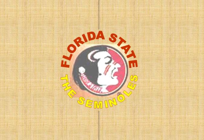
A Little Floor to Enhance the Logo (Florida St.)
Until recent years, it seems, teams' center-court logos were roughly the size of the jump-ball circle (here's one example). To my eyes, that scheme worked well, allowing the logo to enhance the overall look of the court, without overwhelming it. The trend, however, has been toward bigger and bigger logos, as documented in previous postings on this blog (here, here, here, and here).
Tonight, as I watched ESPN's broadcast of Florida State's upset win over defending NCAA champion Duke, I saw yet another example of the outsized emblem, on the Seminoles' court. As shown in the before-and-after photos below, the circular Seminole logo has grown in size (top photo) compared to past years' version, at the expense of the "FLORIDA STATE" and "SEMINOLES" lettering.

(The FSU-Duke screen capture is from ESPN3.com's archived broadcast of tonight's game, whereas the older FSU-Jacksonville footage is something I found on YouTube.)
Not that anyone at Florida State has asked me, but I would suggest something along the lines of the following mock-up I created (with the circular Seminole logo just a little bit bigger than the jump-ball circle).
Subscribe to:
Posts (Atom)


